Ink Tank: UX UI Design
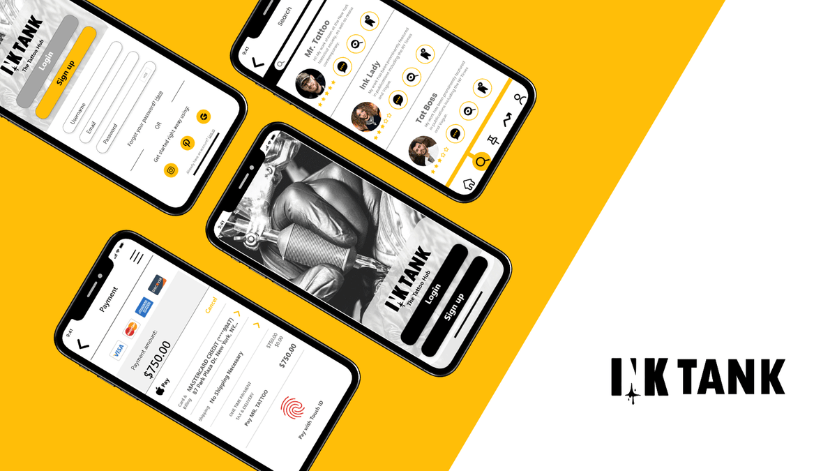
UI Screens
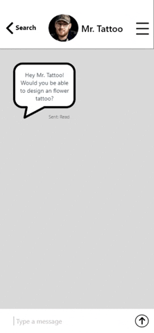
Client InteractionBelow are redesigns as of 9/30/2020(Click to enlarge)


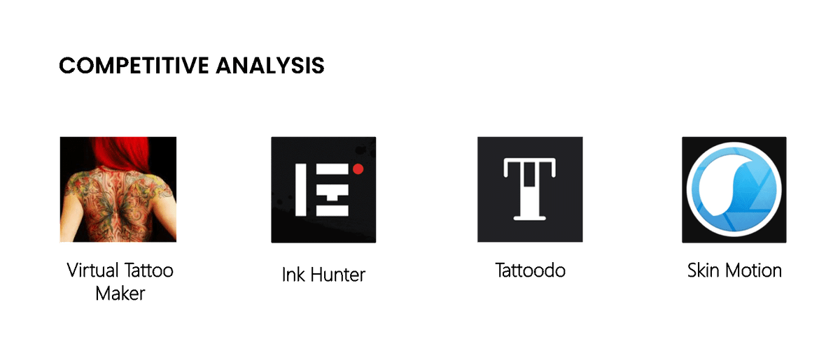
The assumptions were simple enough to validate through competitive/ competitor analysis. It was imperative to assess how users from both sides felt while navigating through similar apps.
THE DISCOVERY
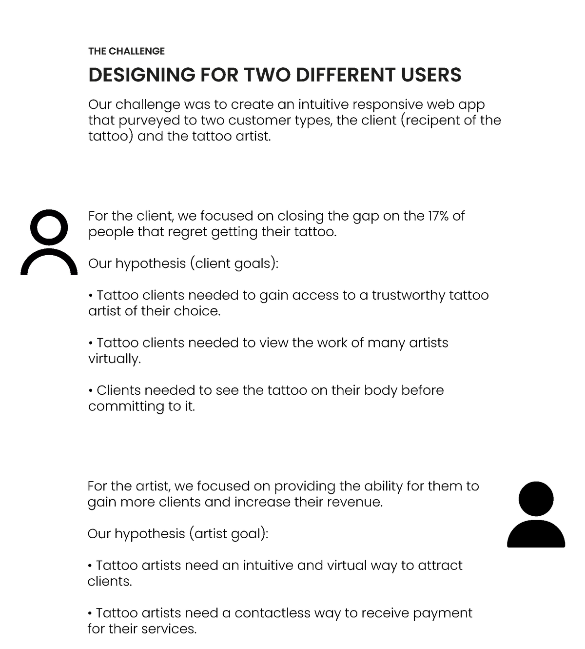
CUSTOMER/ CLIENT INSIGHT
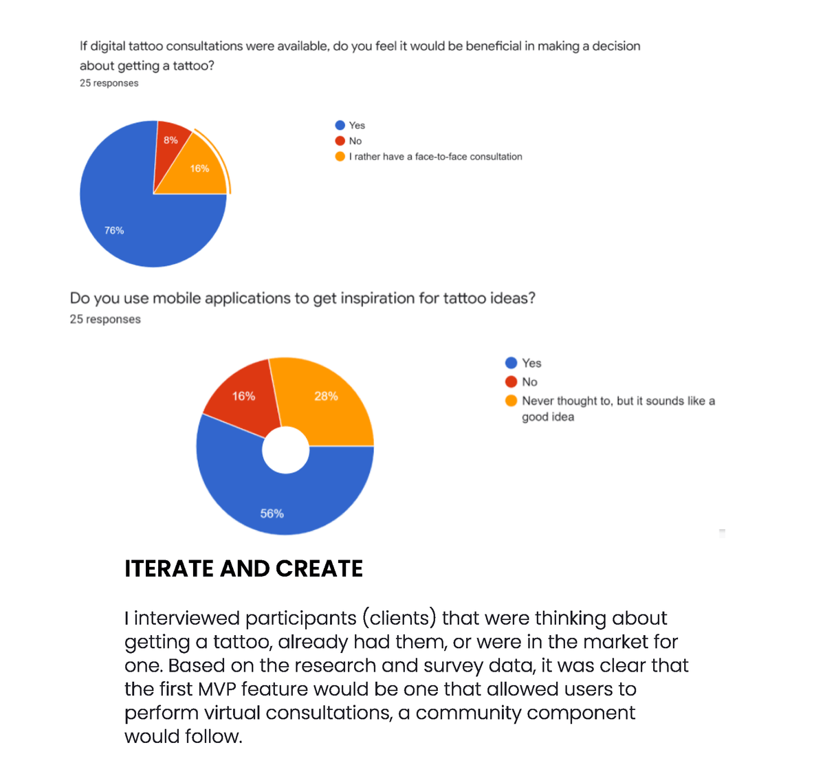
My research uncovered limitations we were not aware of when users interacted with tattoo applications. A twenty- five client-focused survey taken online provided data that revealed after analysis that the competitor apps did not connect users with an actual tattoo artist, nor did they have capabilities for a virtual consultation. Also, there was a need to have a social community where users could discuss tattoo trends, overall advice, and design collaboration.

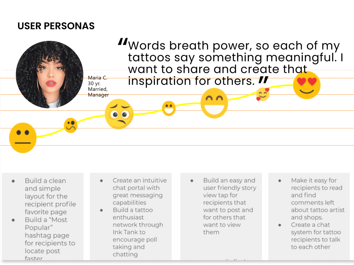
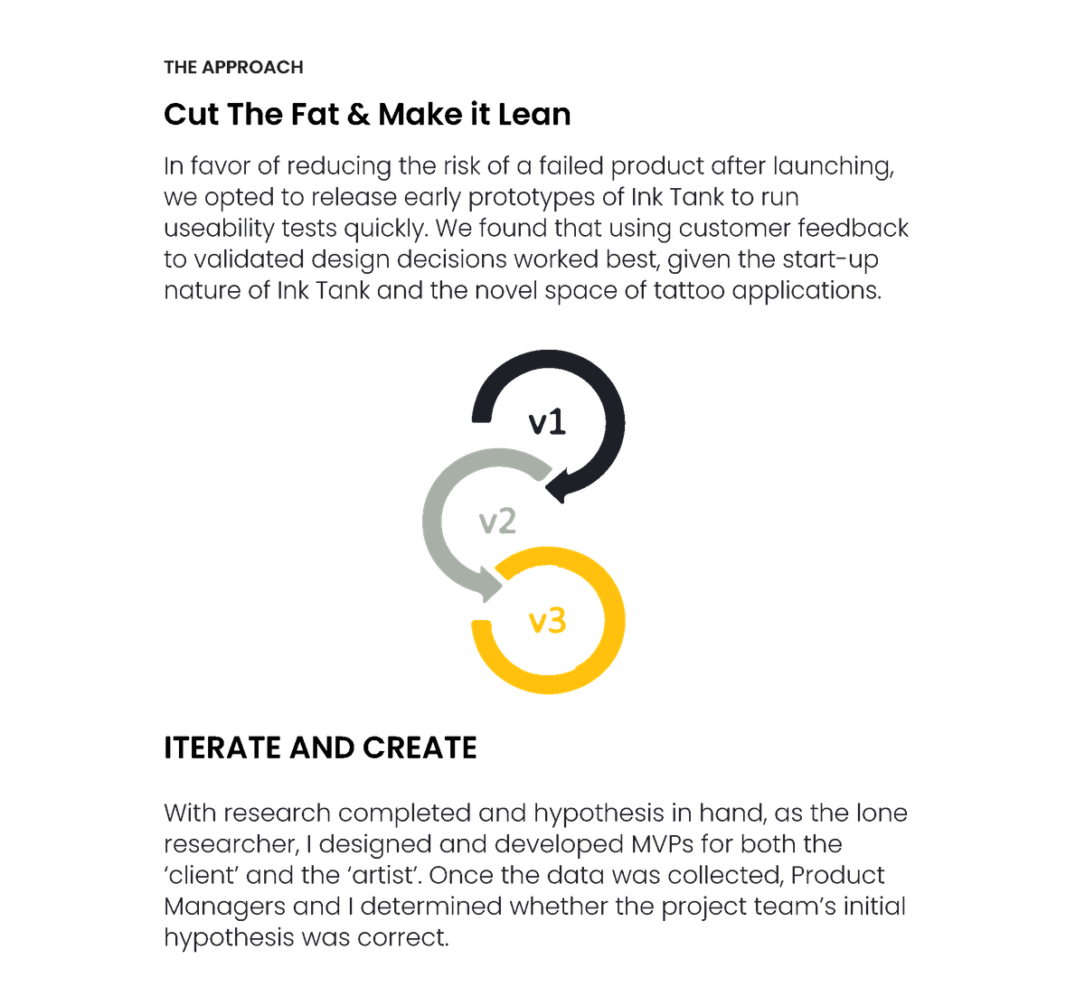
To be certain the MVP feature remained user-centered, I lead a Journey Mapping session where the team and I created user personas from the data received. This productive meeting eventually segued to sketching low fidelity screens that determined the interactions of the "Start a Virtual Consultation" feature.

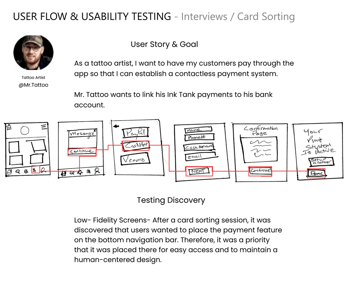
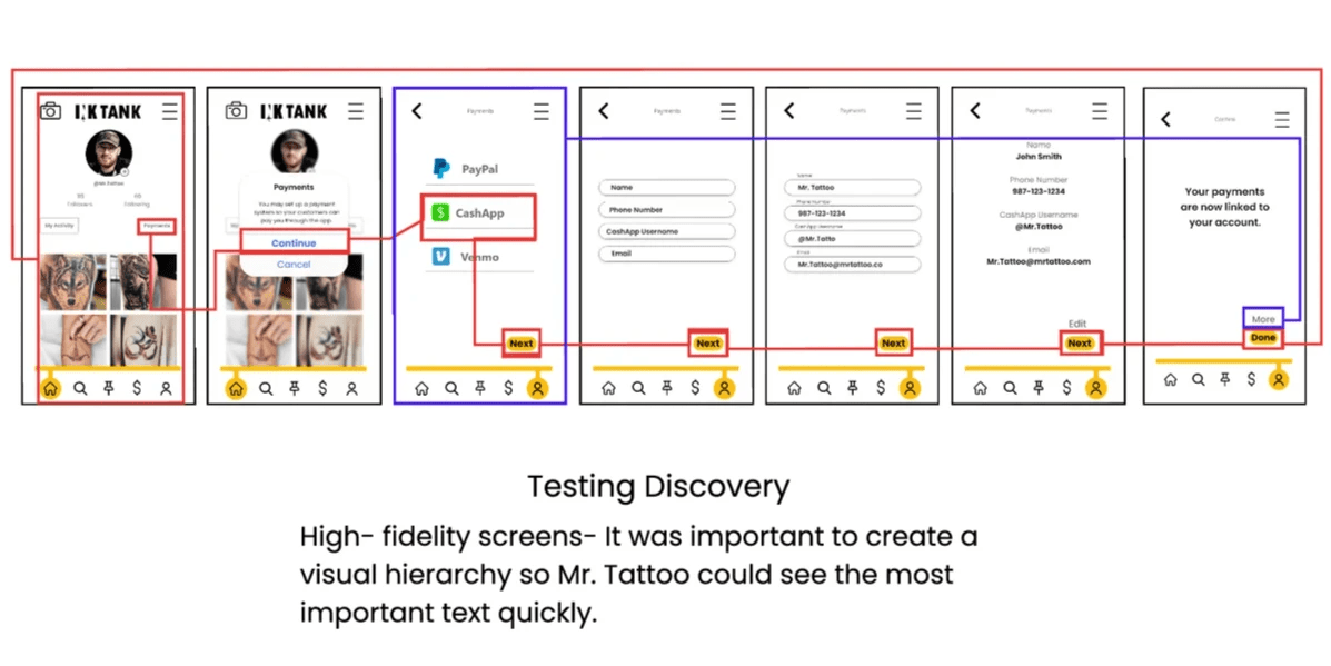
Like on the client-side, I decided to develop an MVP for the tattoo artist. After analyzing the data from both surveys and interviews, I determined the MVP feature for the artist would be to "Link your account". Creating an ability for artists to collect payments through the app was most important for them.

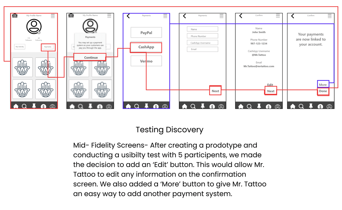
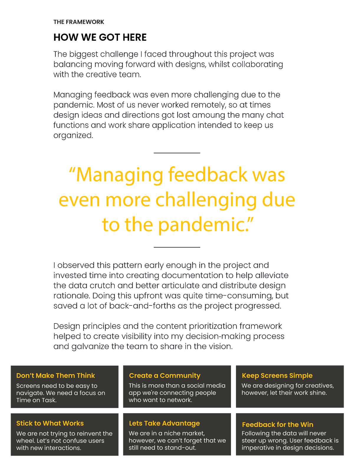
Staying true to the iterative design process, the other designers, the dev team, and I tested each stage of the design before we moved further into the project. We did not move on to the next design stage without confirming testing was a success.

During usability testing of the prototypes, we would take qualitative and quantitative data from each of the participants to improve each iteration. For example, We discovered an error, users could not edit their data once they got to the confirmation screen, this was a usability issue we discovered early when testing the low fidelity screens.
PROTOTYPE "Link Account" Task
Tattoo Artist(Click to enlarge)


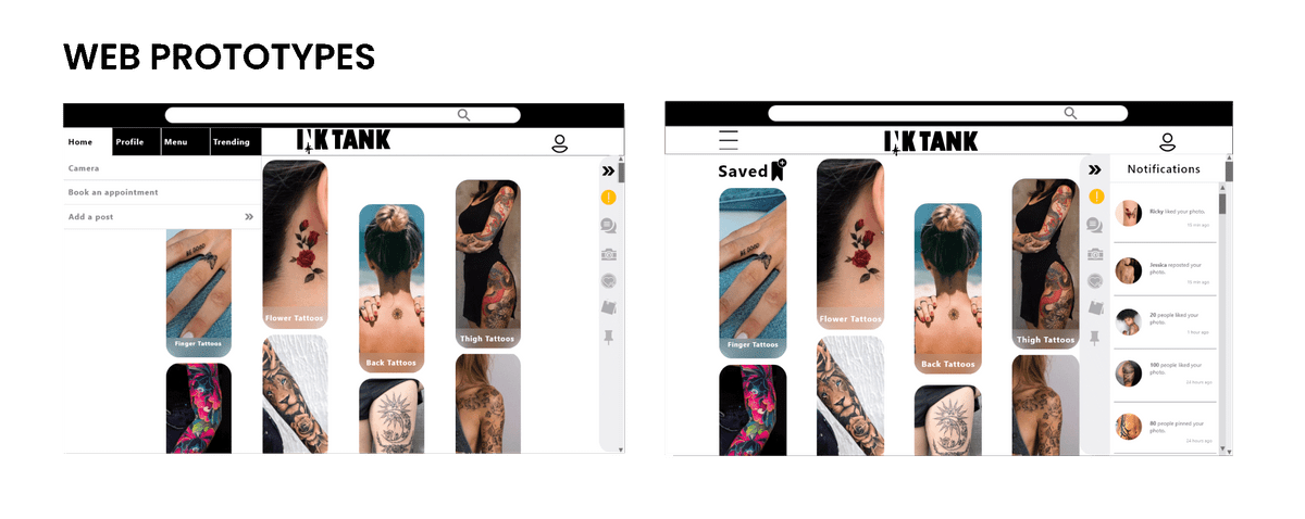
When designing the website for Ink Tank, the developers and I considered both Bootstrap and Foundation components. Ultimately we decided to use Bootstrap’s components due to the time constraint with the development process of Ink Tank.
When collaborating with the design team considering other breakpoints, we believed the 12 column grid layout would better support the responsive design and provide flexibility for components to be aligned more optimally.


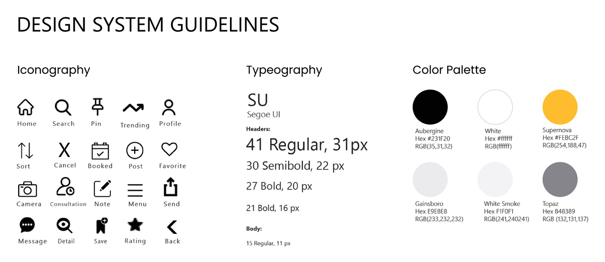
After designing and testing out the prototypes, I was confident that they were successful enough to move on to the design stage. I created this Design Language Style guide to minimize design errors within the agile/ cross-functional teams.

STAY TRUE TO THE CONCEPT
Finally, we arrived at the approved completed screens. Initially, the splash screen was going to have text and icons that gave the user a brief overview of the app. However, it was changed to a close-up image of a tattoo in progress. We made this change to fit the genre of the tattoo culture. This change was validated by comments made by participants during the Preference Testing.

KEEP GUIDELINES IN MIND
To stay true to IOS guidelines, we made changes to the text fields. In the original ‘Sign up/ Login’ screen, the user ran the risk of forgetting the desired information in the field provided due to the absence of a placeholder. This misstep could be a source of friction for the user if they swiftly wanted to move through the signup process.

DON’T BE AFRAID OF CHANGE
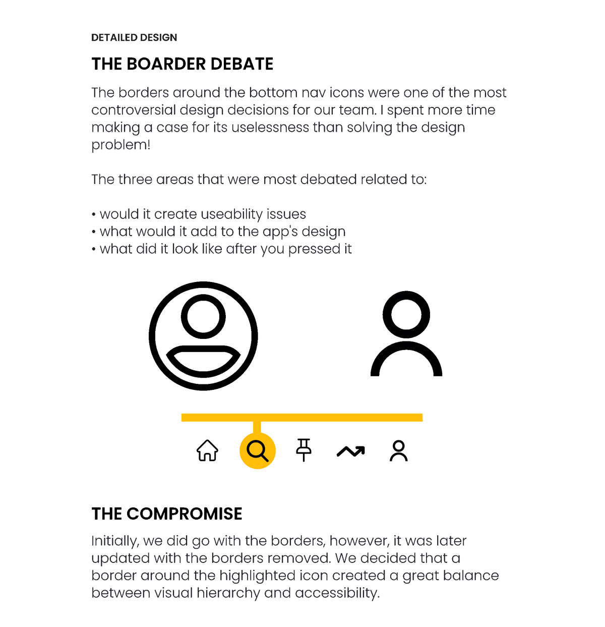
Compared to the updates done on the other screens, the home screen underwent most of the UI changes. Initially, we were going to have the user's notifications be the focus, assuring they wouldn’t miss any alerts within the Ink Tank community, however, it was modified, more clickable components were provided so users may reach other elements of the app quicker. This is also where the new bottom navigation made its debut. A clean, more refreshed look was developed making it appear more modern.

LISTEN TO YOUR PEERS
The participants in the peer collaboration were the driving force around the upgrades on the search screen. The hamburger menu was called out for not being ‘meaty’ enough participants stated "...it doesn't stand out much", they didn’t like all of the negative space and they wanted more of a visual appeal. So along with the iOS guideline changes, we added a version of the 'Trending' screen so users had an alternate way of interacting what others in the community.

STRIVE FOR CLEAN LINES
Lastly, changes made to the scheduling screen were mainly focused on the calendar. The other significant update on the screen was the call to action tab “Confirm Appointment”. We updated the border to be more cylindrical to remain consistent with the other clickable tabs in the app. The sorting icon was replaced with one more universally recognized to be more in line with usability guidelines.
Ink Tank Demo
In an effort to stay true to testing results, below are the original screens. The redesigns were created on 9/30/2020 (see above).